SE
A real-time operations center that gives logistics teams one calm view of routes, risks, capacity, and exceptions.

Role
Product Designer
Timeline
10 weeks
Team
3 Engineers, 1 PM, 1 Data Scientist, 1 Product Designer
Platform
Web
Challeneges
Approach
Solution
Impact
Designed as the central parent table for Planning Space, its UI patterns, codebase, and core functionality scale across the organization's entire planning suite.


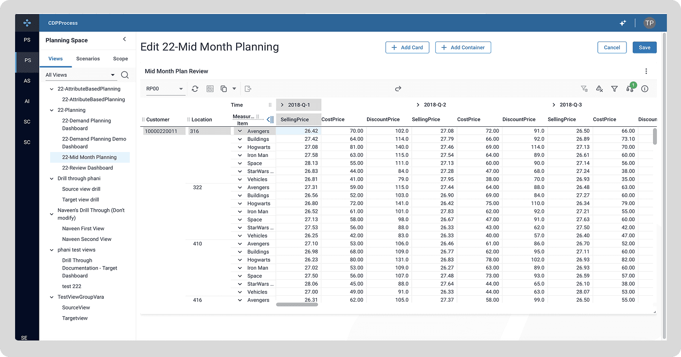


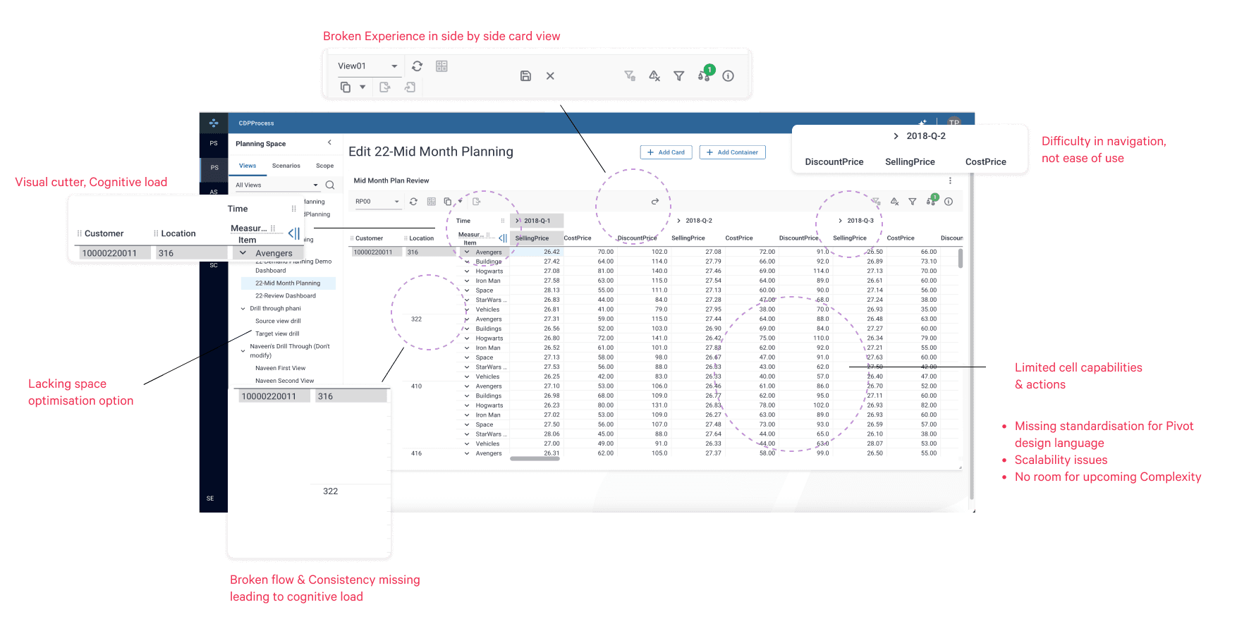
Journey from Poor usability to Seamless experience
Researched industry patterns to establish effective UI elements, collaborated closely with design system and functional teams for seamless implementation, and iterated through rigorous testing.


Micro-Interaction
1/50- Data Segregating Lines (Before)
The pivot table suffered from unaligned elements and disrupted visual flow, connections, making it challenging to quickly read and connect data.

1/50- Lines (After)
The pivot table suffered from unaligned elements and disrupted visual flow, connections, making it challenging to quickly read and connect data.

2/50- Swiping Position of x and y axis
Before: Ambiguous axis-swapping behavior and inconsistent visual feedback left users confused about which elements were being moved.
After: Introduced clear interaction states where grabbing a header blurs the active row/column, and a dotted blue outline highlights the target swap zone.

3/50- Collapse/Expand of Vertical Columns
Before: Ambiguous axis-swapping behavior and inconsistent visual feedback left users confused about which elements were being moved.
After: Introduced clear interaction states where grabbing a header blurs the active row/column, and a dotted blue outline highlights the target swap zone.


Over the span of six months, each interaction pattern and interface element was iteratively developed and standardized into the organization’s design system.
Deployed UX! 2025


Small Change, Big Impact Created!

